Continued from post here
For all smart light brands, the brightness and color of installed lights as well the behavior of accessories (e.g., motion sensors, remotes) are controlled with an app. Generally all apps are user friendly and guide you through a step-by-step instruction set. Thus, the average user becomes familiar with the app relatively quickly.
Control of Hue smart lights/plugs
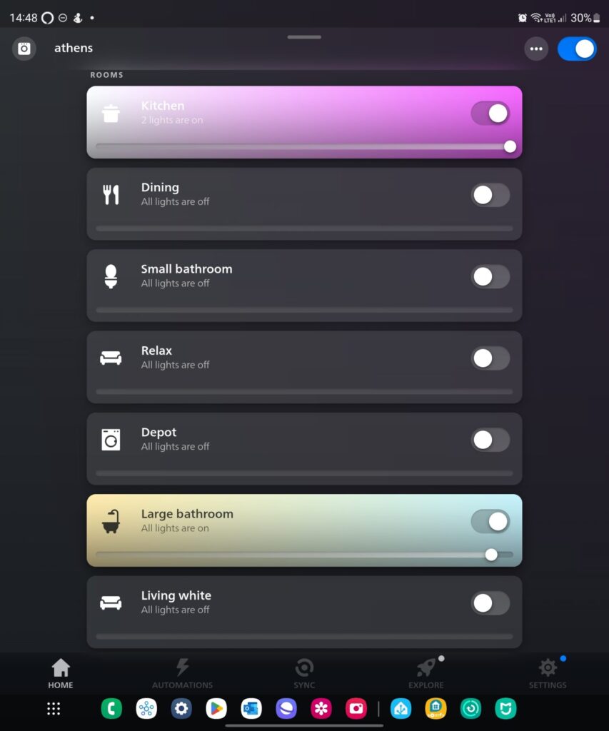
The home screen of the Hue app shows all the available rooms (Figure 1). We can turn room lights, as a group, on or off with the switch located to the right. We can also change room brightness with the slider.
- Figure 1. Hue rooms
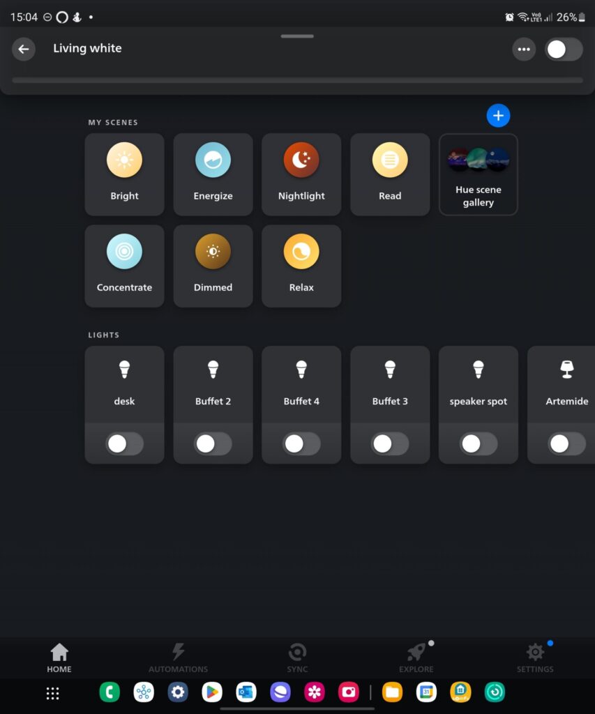
- Figure 2. Hue lights per room
By clicking a room, we have access to its lights (Figure 2). Here we can control the color and the brightness of each light. We can also select one of the available scenes, which are predefined combinations of color and brightness. Hue handles plugs as lights.
Control of Hue accessories
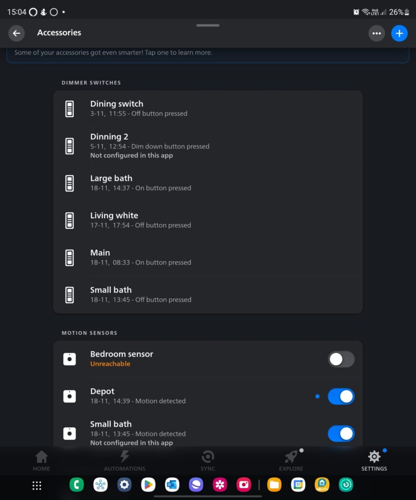
Clicking ‘settings’ on the lower right corner of the Hue app (Figure 1) opens the accessory page (Figure 3). Here we can select each accessory and control its function .
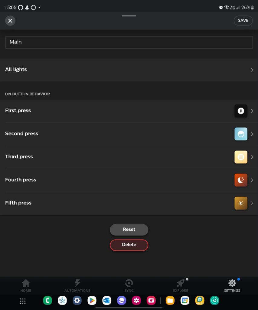
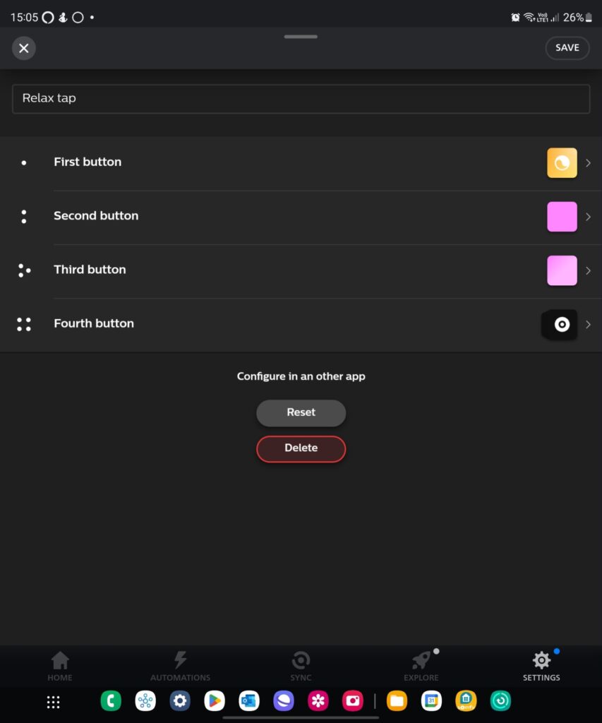
For instance, we select which room or light(s) each remote switch controls (Figure 4a). We also define which scenes will be activated depending on the number of times we press the ‘on’ switch button. For Hue tap we configure the four button (Figure 4a).
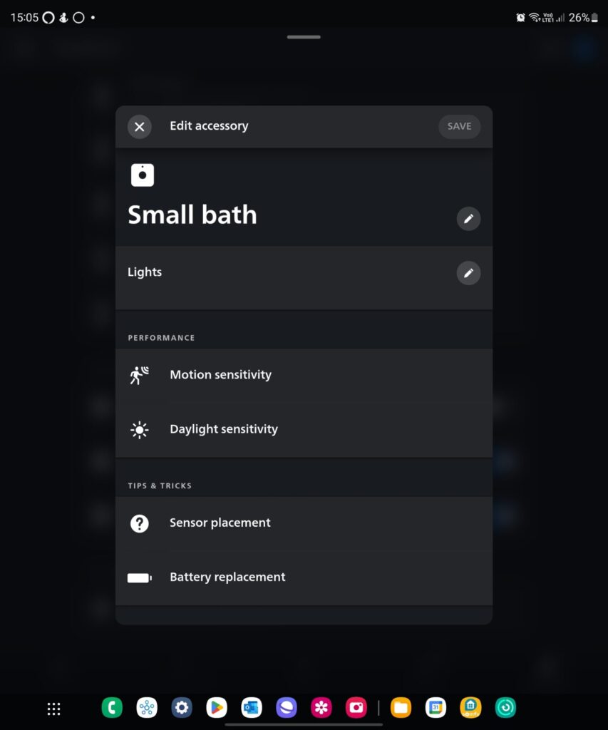
For motion sensors (Figure 5) we select the room or light(s) that will turn on when motion is detected. We also set the amount of time after which the lights will turn off when there is no motion detected. There are also an indication of battery state and options for setting motion and daylight sensitivity and.
The user can define up to 10 time slots. In other words, there are ten combinations of (light scenes) x (duration that lights remain on), depending on the hour of the day.
- Figure 3. The accessory page
- Figure 4(a). Hue remote
- Figure 4(b). Hue tap
- Figure 5. Hue motion sensors
Control of lights/plugs of other brands
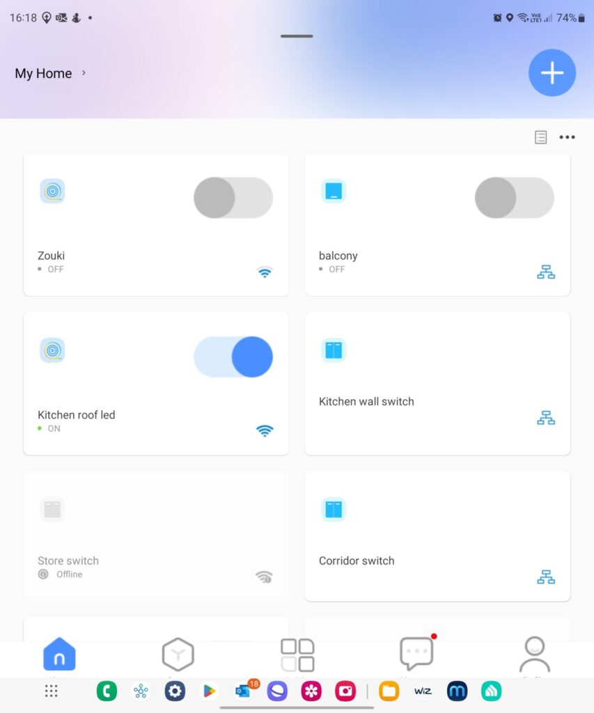
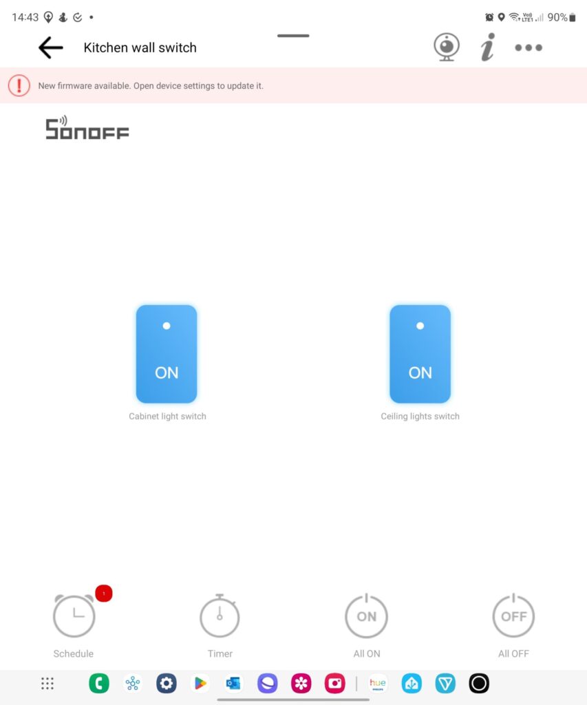
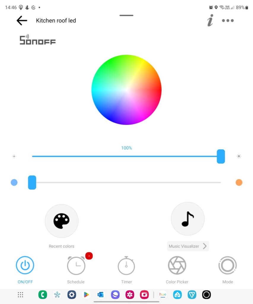
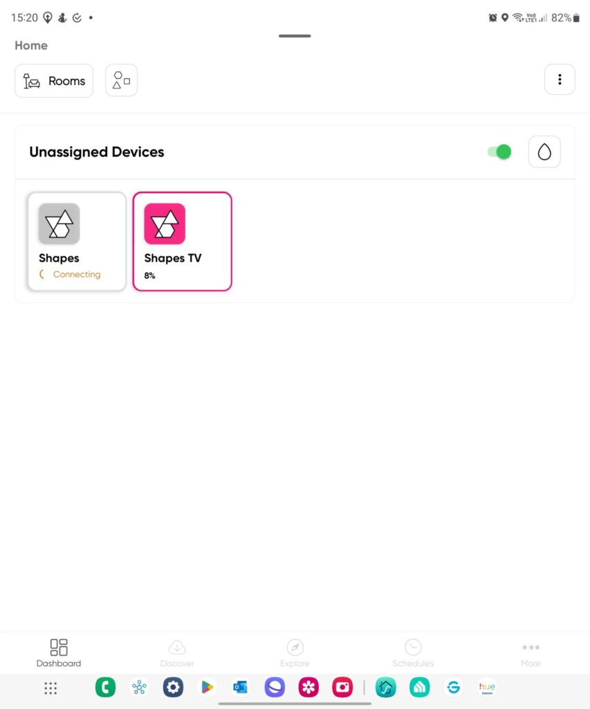
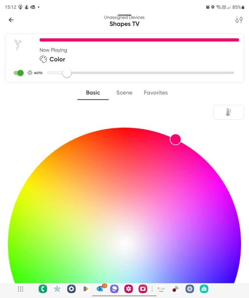
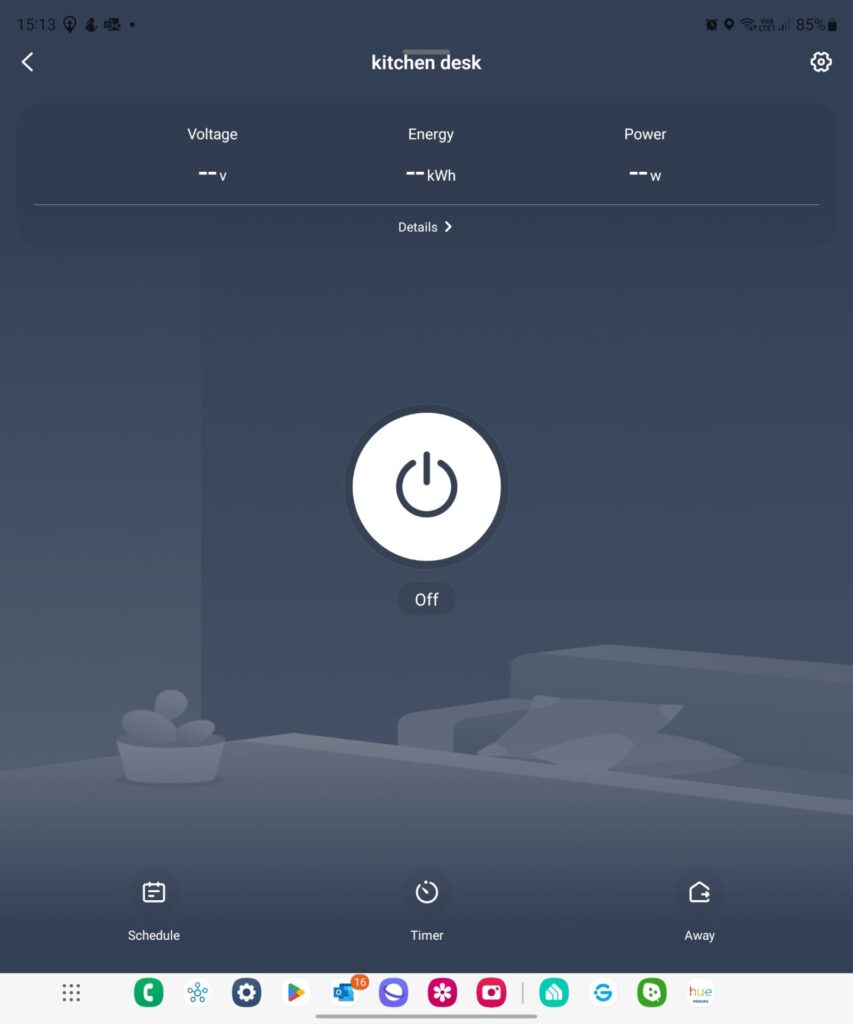
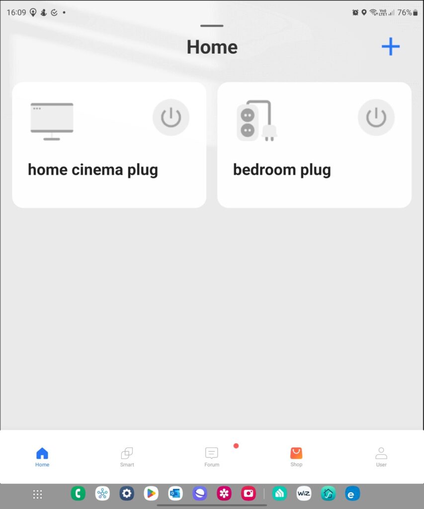
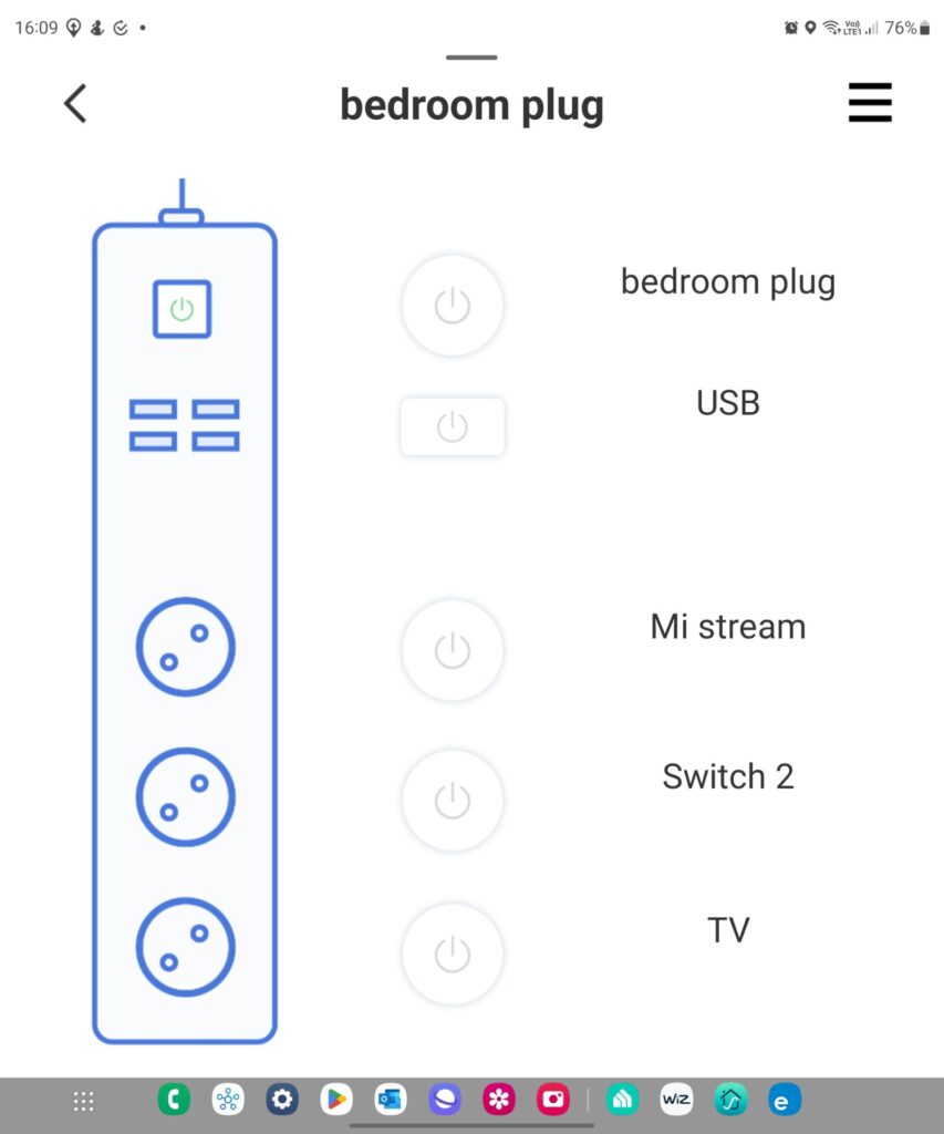
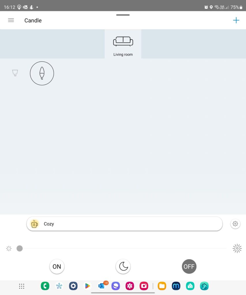
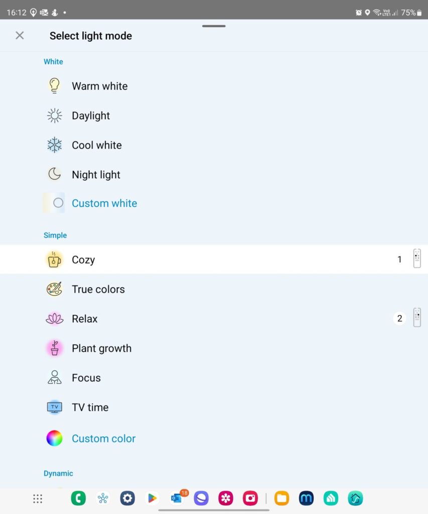
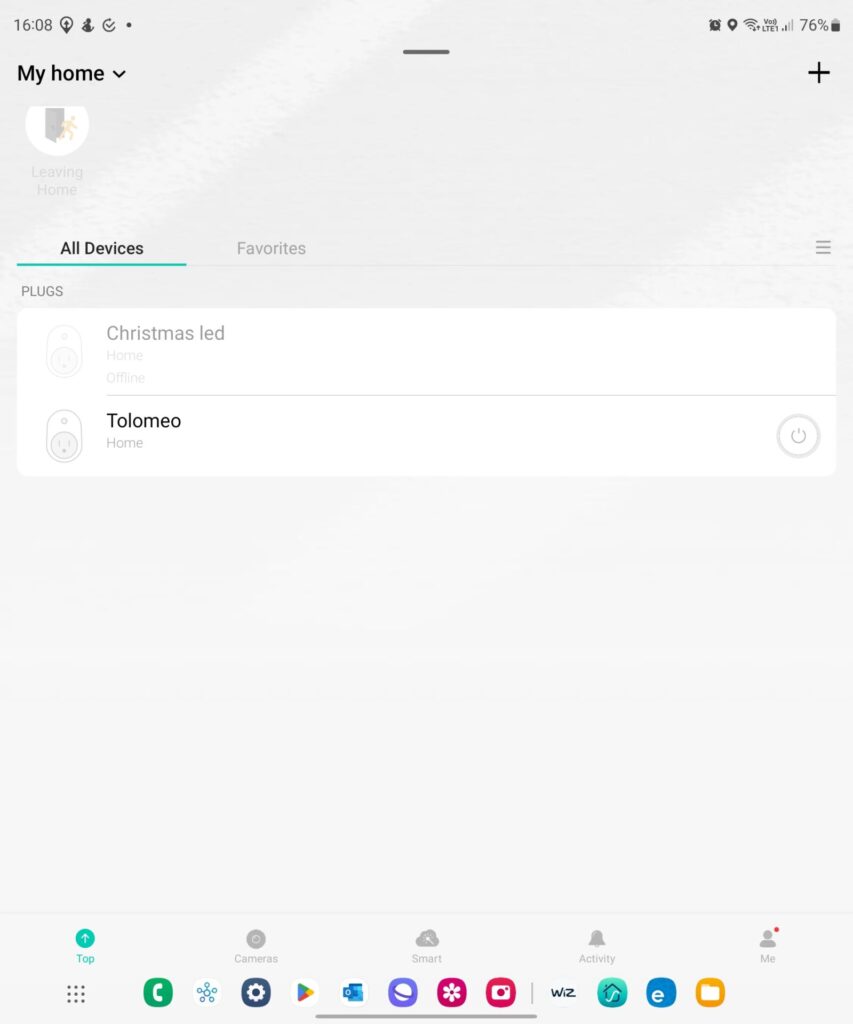
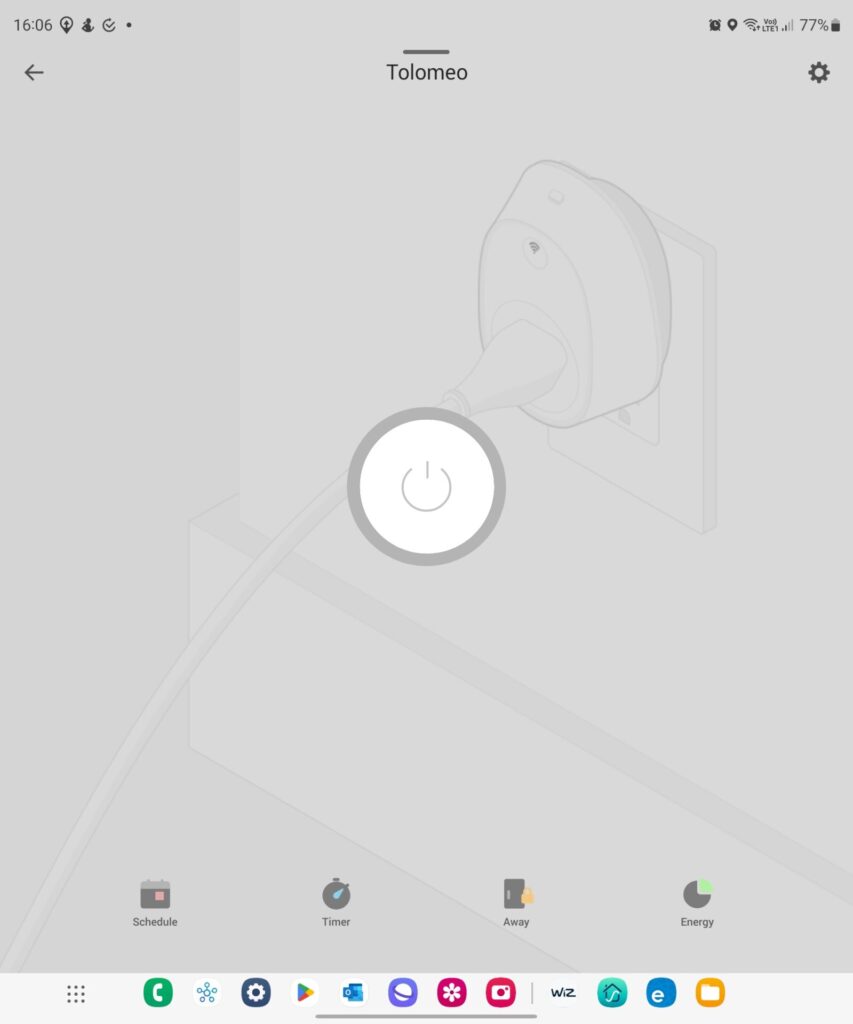
Control of lights, plugs and accessories for other brands generally follows the same philosophy. Lights and plugs are controlled either individually or as a group (e.g., room). I show here examples for eWeLink, TP-Link Kasa, Nanoleaf, Meross, Vesync and Wiz (Figures 6 to 17).
Most brands also show information on energy consumption. In settings there is also information on battery level and the option to update devices’ firmware.
Certainly, some apps, such as Hue, are better designed, less cluttered, and more refined, aesthetically pleasant, and operational than others.
- Figure 6. eWeLink lights and switches
- Figure 7. eWeLink wall switch control
- Figure 8. eWeLink led control
- Figure 9. Nanoleaf lights
- Figure 10. Nanoleaf ligth control
- Figure 11. Vesync plug control
- Figure 12. Meross plug control
- Figure 13. Meross multiplug control
- Figure 14. Wiz light control
- Figure 15. Wiz Light control
- Figure 16. TP-Link Kasa plugs
- Figure 17. TP-Link Kasa plug control
Hue app: shortcomings
The Hue app suffers from shortcomings which I will cover in the last post of the smart light series. Here, I focus on those related to the room and light pages (Figures 1 and 2).
Rooms are arranged in one column and depicted as a bar extending from edge to edge (Figure 1). On my Samsung Fold 4 phone the app displays seven rooms per page. I have 10 rooms. Thus I must scroll down to reach the last room. If rooms are arranged in two or three columns, then there will be 14 or 21 rooms per page. This is more than enough for most cases.
The same is also true of the light page (Figure 2). But in this case scenes and lights are arranged in a row! My light page displays six lights, and I must scroll horizontally!
I need 6 seconds to reach the lights of the tenth room as opposed to 2 seconds for the lights of the first seven rooms, i.e., for which no scrolling is involved. Remember, smart means save time. Philips Hue must fix this.
Continued to post here
0 Comments